Choose the most flattering, accurate vanity lighting. Learn the best Kelvin range for bathrooms, when to use 2700K–3500K, why CRI 90+ matters, and how to pla...
Warm Lumen
CRI Explained: Why Color Accuracy Matters in Home Lighting

Lumi
Lumi is the friendly little firefly host of Warm Lumen, with a heart that glows as brightly as a perfectly placed pendant lamp. He loves discovering how soft bulbs, warm color temperatures, and layered lighting can transform any dark room into a welcoming retreat. Lumi is always fluttering by to share bright ideas and cheer you on as you create a beautifully lit space.
Published
Let’s find the perfect glowing touch for every corner of your home. If you have ever painted a wall that looked dreamy in the store but a little strange at night, you are not imagining it. The culprit is often a sneaky lighting detail: Color Rendering Index, also known as CRI.
CRI is not about how bright a bulb is or how warm it feels. It is about how true colors look under that light. And once you understand it, picking bulbs gets a whole lot easier.

What CRI means
CRI is a score that describes how accurately a light source reveals colors compared with a reference light of the same color temperature. In the CRI standard, that reference is typically a blackbody source at warmer color temperatures and a daylight model at cooler ones.
You will usually see CRI (also written as Ra) reported on a 0 to 100 scale on consumer bulb packaging. Higher scores mean colors look more natural and recognizable.
- CRI 90 to 100: Excellent color accuracy. Colors look lively and true.
- CRI 80 to 89: Good and common for many standard LED bulbs.
- Below CRI 80: Colors can look muted, grayish, or a bit off, especially reds and skin tones.
Think of CRI like a light’s ability to show the full paint palette of your room. A low CRI light can still be bright, but it may not reveal color well.
Why CRI matters at home
1) Wall paint and decor can look different at night
Paint undertones are sensitive little creatures. Under low CRI lighting, warm creams can turn muddy, crisp whites can look dingy, and some blues and greens can flatten out.
If you are dialing in your home’s glow, it helps to understand CRI alongside color temperature. CRI is about accuracy, while color temperature is about mood. If you want help with warmth levels, head over to Best Color Temperature for Bathroom Vanity Lighting, since bathrooms are a place where both warmth and accuracy matter.
2) Food looks fresher when reds render correctly
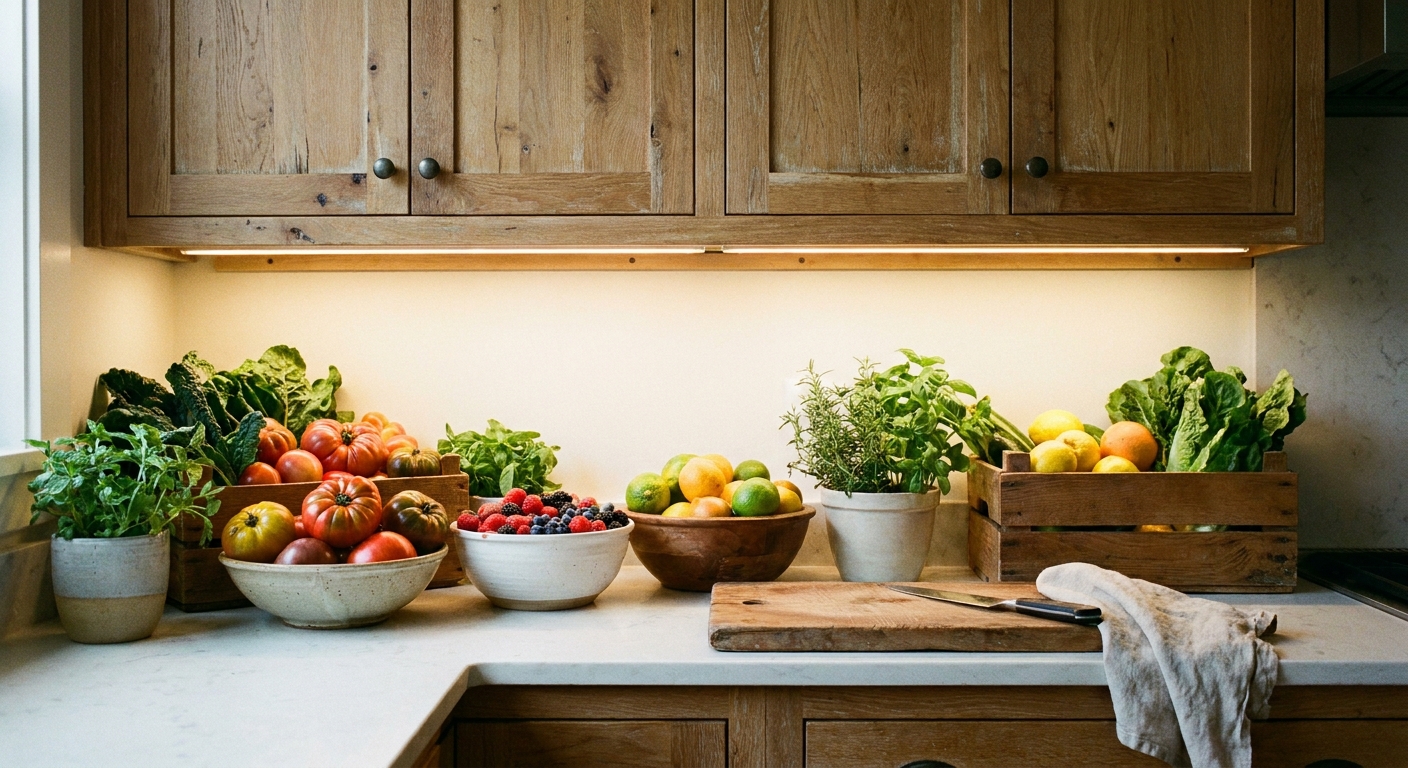
Many LEDs (especially older designs, budget bulbs, or efficiency-first models) struggle with deep reds. That can make tomatoes, berries, meats, and even baked goods look less appetizing on the counter or dinner table. High CRI lighting helps food look closer to how it appears in daylight.
3) Clothing and makeup look more trustworthy
If your closet lighting makes navy look black or your mirror lighting makes skin look gray, CRI could be the missing piece. High CRI lighting makes subtle differences easier to see, which helps you avoid stepping outside with mismatched colors.
4) People look healthier in high CRI light
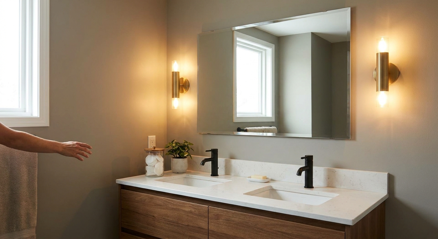
Skin tones are complicated blends of reds, yellows, and browns. With higher CRI, faces tend to look more natural, not sallow or washed out. This is especially important in bathrooms and anywhere you gather with friends.
CRI vs lumens vs color temperature
These three get mixed up all the time, so here is the simplest way to separate them:
- Lumens: how much light you get (brightness).
- Color temperature (Kelvin): how warm or cool the light looks.
- CRI: how accurate colors look under that light.
If you need help with brightness planning room by room, this is a helpful lantern on the path: Calculate the Right Lumens for Any Room. For the bulb basics in general, Lighting Basics & Education is a cozy place to start.
What CRI should you buy?
Most homes feel noticeably more alive once you prioritize CRI in a few key places. You will often notice it as colors looking less gray, skin looking more natural, and warm materials (wood, leather, brass) looking richer.
Here are friendly targets that usually work well:
- Living rooms, bedrooms, hallways: Aim for CRI 90+ if you can, especially if you have artwork, colorful textiles, or warm paint colors.
- Kitchens: Aim for CRI 90+. Food prep and ingredient colors are easier to judge.
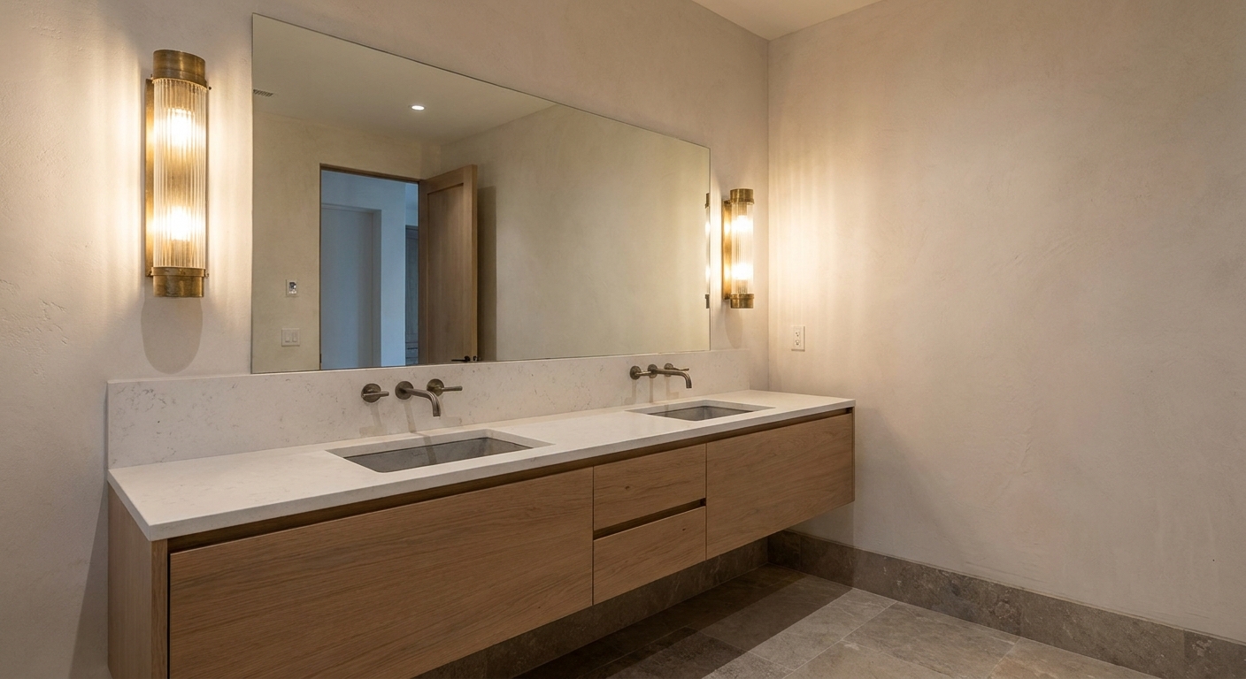
- Bathrooms and vanity lighting: Aim for CRI 90+ (and ideally consistent lighting on both sides of the mirror).
- Closets and laundry rooms: Aim for CRI 90+ if you match outfits often or want true fabric color.
- Garage, attic, utility areas: CRI 80+ is usually fine unless you do detailed hobby work.
If you are updating functional spaces on a budget, DIY Garage and Utility Room Lighting Upgrades can help you focus on changes that feel big without being fussy.
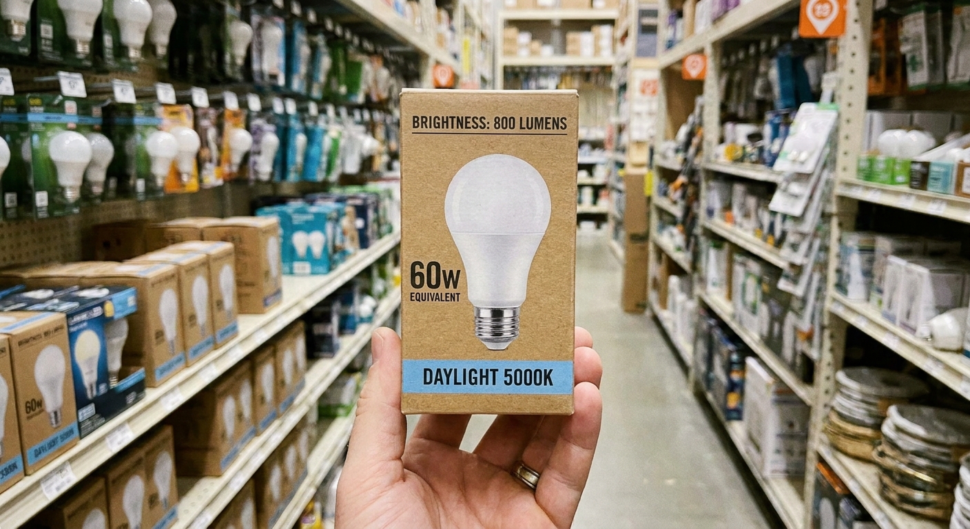
How to find CRI on the box
Look for “CRI” or “Ra” on the box or product listing. Some packages highlight it clearly, others tuck it into specs.
Helpful signs
- “CRI 90”, “CRI 92”, “CRI 95”
- “High CRI” paired with an actual number
- “Color accurate” with an explicit CRI value
Little cautions
- No CRI listed: It might be fine, but it is a gamble.
- Mixing random bulbs in the same room: Even if all are “warm white,” different CRI and different spectral power distribution can make one corner look slightly dull or tinted.
- Watch for tint shifts: Two bulbs can share the same Kelvin number and CRI, yet one looks a bit green or a bit pink. That tint (often discussed as Duv) is a separate reason rooms can feel off.
- Very cheap multi-packs: They often prioritize low cost over color quality. Not always, but often.
CRI, R9, and missing reds
Traditional CRI is a broad score, but one special detail matters for homes: R9, which is a measure of saturated red rendering. Some lights can score decently on CRI but still do a poor job with reds, which affects food, skin, wood tones, and warm decor.
Not every bulb lists R9, but if you see it and it is 50+, that is often considered a decent sign for homes as a rough benchmark. If you love rich, cozy color (or you are picky about makeup and skin tone lighting), higher is better. Many premium options aim for R9 80+.
One more gentle reality check: CRI is useful, but it does not capture everything about color quality. There are newer ways to describe color rendering, like IES TM-30 (Rf and Rg), but most household bulb packaging still leans on CRI and sometimes R9.
For readers who like definitions straight from standards bodies, the CIE (International Commission on Illumination) has background on color rendering concepts here: https://cie.co.at/.
Where high CRI helps most
If swapping every bulb at once feels like too much, start where your eyes and decisions live:
- Bathroom mirror lighting for skin tones and daily routines
- Kitchen task lighting for food color and prep
- Closet lighting for clothing choices
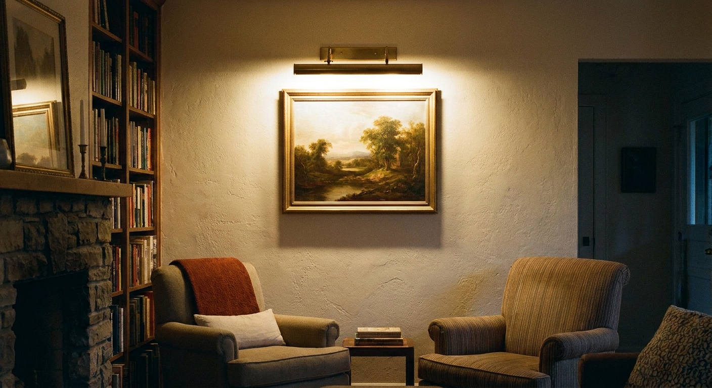
- Any lamp next to art for true paint and print colors
And if your kitchen is a mix of cans, pendants, and under-cabinet strips, layering helps as much as bulb quality. This guide can help you build a balanced glow: How to Layer Kitchen Lighting.
Common CRI questions
Does higher CRI always mean better lighting?
Higher CRI usually means better color accuracy, but comfort also depends on glare control, brightness, beam spread, tint, and color temperature. A very bright exposed bulb can feel harsh even if the CRI is excellent.
Can I tell CRI just by looking?
Sometimes. If reds look weak, skin looks grayish, or your room’s colors seem flat, CRI may be low. But the easiest path is still checking the specs.
Is CRI 80 good enough for a living room?
It can be, especially if the space is mostly neutral. But if you have warm paint, wood tones, colorful textiles, or artwork you love, CRI 90+ is a noticeable upgrade.
Do smart bulbs have good CRI?
Many do, some do not. Treat CRI like any other spec and look it up model by model. If you are deciding between smart bulbs and smart switches, this guide can help with the bigger decision: Smart Bulbs vs Smart Switches.
What is the easiest way to test before I replace everything?
Buy one bulb first and do a quick side-by-side test at night. Turn on the new bulb in one lamp, keep your old bulb nearby, and compare how a white towel, your skin in a mirror, and something red (an apple, a tomato, a lipstick) look under each light. If the upgrade feels calmer and more natural, standardize the bulbs in that room for the most even result.
A simple takeaway
When colors in your home feel a little off, it is not always the paint, the decor, or your eyes. Often, it is the bulb. Choosing high CRI lighting helps your walls, food, fabrics, and faces look the way they are meant to look.
If you remember one tiny rule, make it this: for spaces where you care about color, aim for CRI 90 or higher. It is one of the quickest ways to make a room feel more vibrant without changing a single thing on your shelves.