Refresh 1990s track lighting fast—identify H/J/L track, choose LED heads or better bulbs, or replace the whole run. Includes aiming, dimmer compatibility, an...
Warm Lumen
Art and Picture Lighting for Gallery Walls

Lumi
Lumi is the friendly little firefly host of Warm Lumen, with a heart that glows as brightly as a perfectly placed pendant lamp. He loves discovering how soft bulbs, warm color temperatures, and layered lighting can transform any dark room into a welcoming retreat. Lumi is always fluttering by to share bright ideas and cheer you on as you create a beautifully lit space.
Published · Last updated
Let’s find the perfect glowing touch for every frame and canvas. Picture lighting is one of those tiny upgrades that can make a whole room feel intentional, like your art is getting the gentle spotlight it deserves instead of disappearing at night or fighting glare.
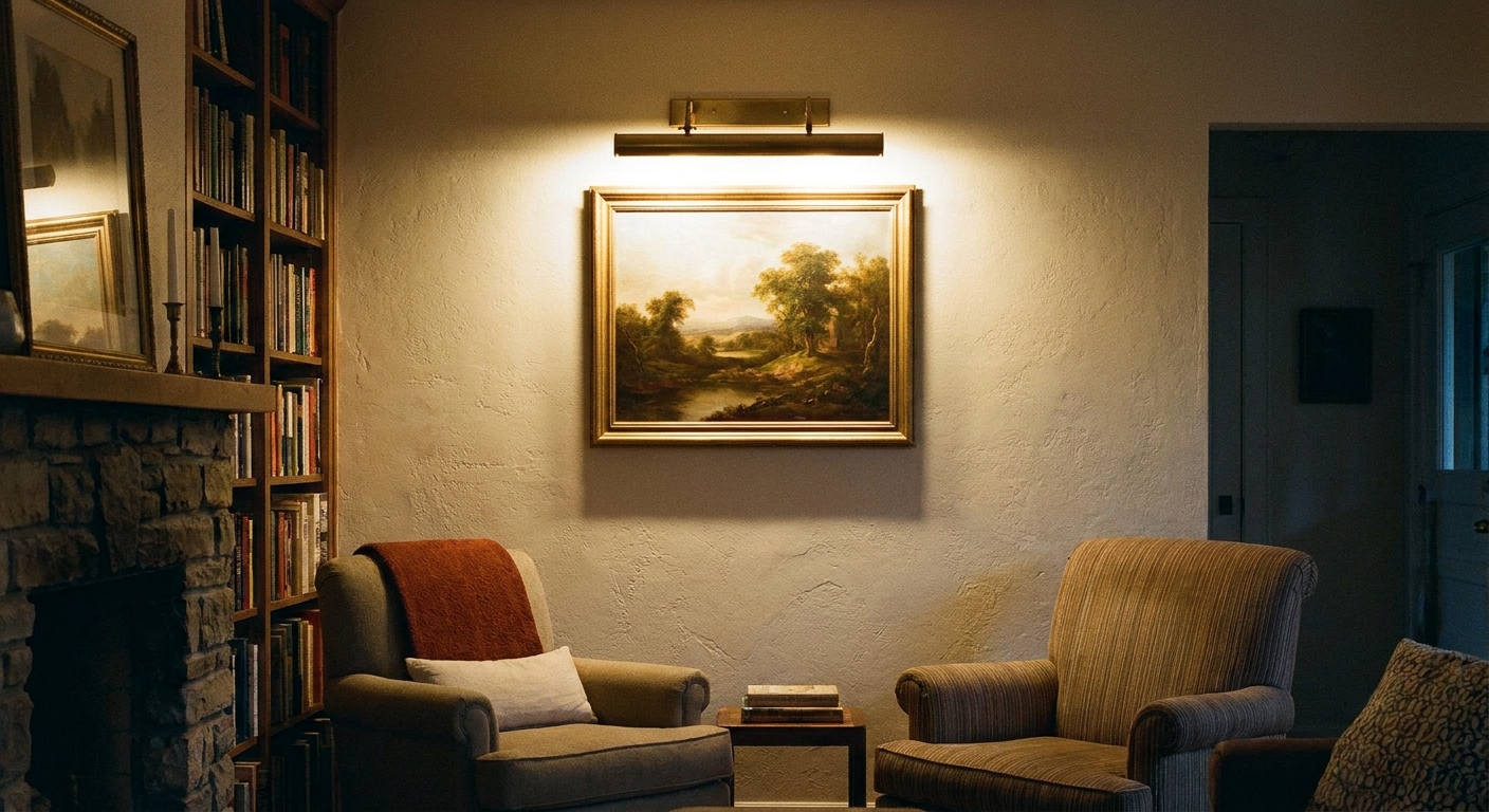
What great art lighting does
Good picture lighting is not about making the art as bright as possible. It is about making it easy to see, true to color, and comfortable to look at from different spots in the room.
- Even coverage: Light spreads across the full piece without a hot spot in the center.
- Low glare: You do not see a bright reflection of the bulb or room lights in the glass.
- Accurate color: The art looks like itself, not too yellow, too blue, or gray.
- Protected finish: Heat and UV are minimized, especially for delicate paper and textiles.
If you are building a fuller lighting plan, the layering approach used in kitchens applies beautifully to display walls too. See How to Layer Kitchen Lighting for a simple way to think in ambient, task, and accent light.
Pick your fixture type
1) Dedicated picture lights
This is the classic bar light mounted above the frame. It can be hardwired, plug-in, or battery powered. Many versions have an adjustable head so you can aim the beam.
- Best for: Single statement pieces, formal galleries, art over mantels and consoles.
- Look: Polished and “museum-like” when sized correctly.
2) Track lighting
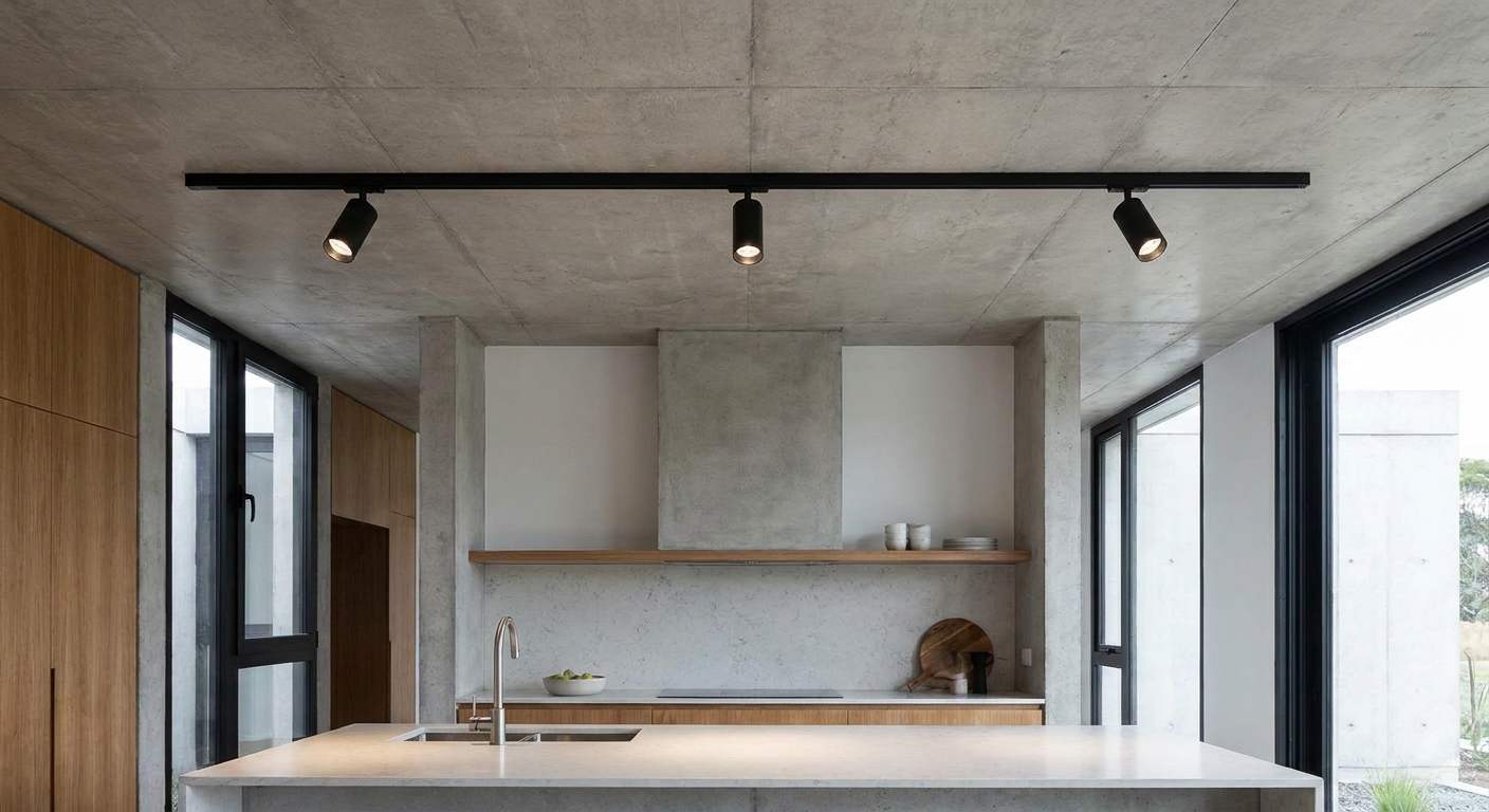
Track gets a bad reputation because older systems can look dated, but modern tracks with small, aimable heads are fantastic for gallery walls.
- Best for: Multiple frames in a line, frequently changing displays, or lighting an entire wall evenly.
- Renter-friendly angle: In some homes, you can swap an existing ceiling fixture for a short track that mounts to the same ceiling junction box (with permission). There are also plug-in track systems for situations where hardwiring is not an option.
- Strength: Each head can be aimed and re-aimed as the wall evolves.
If your current track feels stuck in another decade, this can help: Modernizing Outdated Track Lighting.
3) Wall sconces or ceiling spots as accent lighting
Aimable sconces or small ceiling-mounted spots can wash a wall and make art feel part of the room’s architecture, not just a “lit object.”
- Best for: Textured canvases, large walls, art that is not under glass.
- Tip: A wider beam angle usually looks calmer than a narrow spotlight.
For a style overview and where different fixtures make sense, see Fixtures & Styles.
Hardwired vs. plug-in vs. battery
The “right” power choice depends on how permanent you want the installation to be and how often the art changes.
Hardwired
- Pros: Cleanest look, no visible cord, best for dimming, great for long daily use.
- Cons: Requires an electrical box or wiring plan. Often a job for a qualified electrician.
- Best for: Permanent placements and high-impact artwork.
Plug-in
- Pros: Simple installation, reliable power, usually dimmable if paired with the right control.
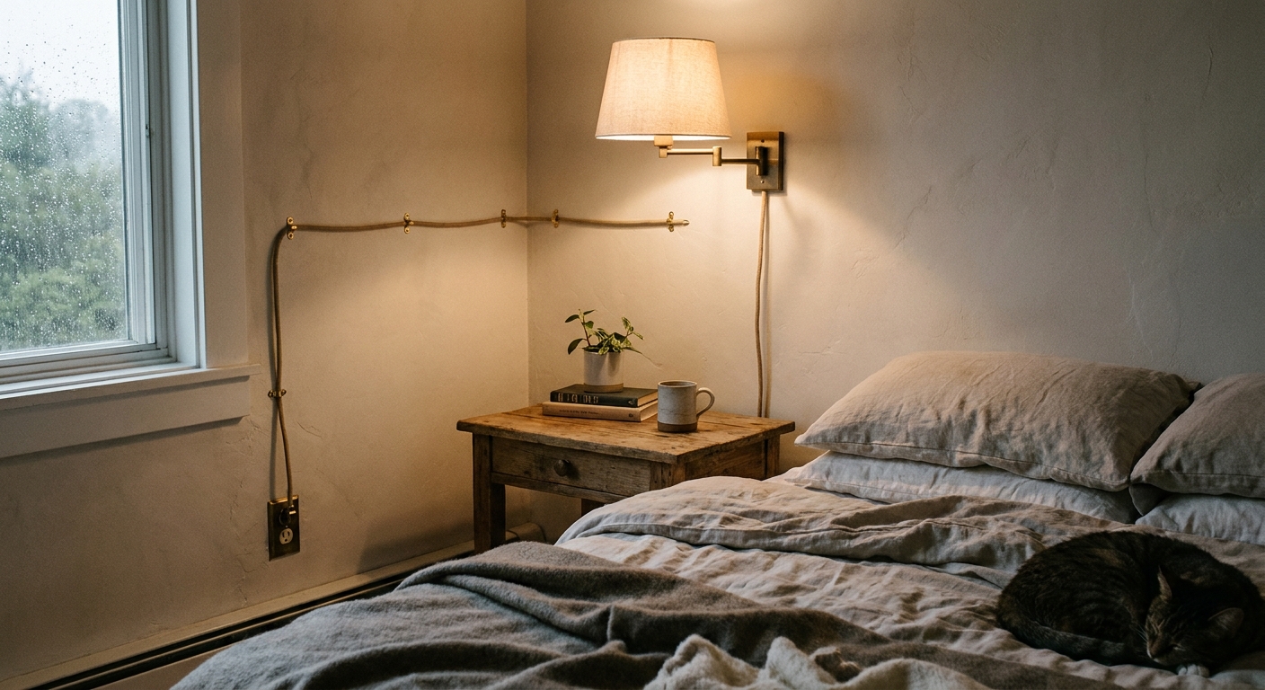
- Cons: Cord management matters. You may need paintable cord cover to keep things tidy.
- Best for: Renters or anyone who wants an upgrade without opening walls.
If you need cord-hiding strategies that still look polished, Renter-Friendly Plug-In Wall Sconces and Cord Hiding Tricks has ideas that translate nicely to plug-in picture lights.
Battery-operated
- Pros: No wiring, no cord, fast to mount, great for “floating” frames or tricky spots.
- Cons: Battery changes or recharging, brightness is often lower than hardwired, some models have limited beam control.
- Best for: Small to medium pieces, hallways, occasional-use lighting, or when you want the clean look without wiring.
A tiny firefly reminder: If your light will be on for hours each night, hardwired or plug-in usually feels easier long-term. If it is mostly for evening ambiance or guests, battery can be delightfully simple.
Color temperature and color quality
This is where artwork lighting often goes wrong. The goal is warm and inviting, but still true to the art’s colors.
Best color temperatures for most homes
- 2700K: Warm, cozy, very flattering in living rooms and bedrooms. Great for traditional art, warmer palettes, and wood-heavy spaces.
- 3000K: Still warm, but a touch cleaner. A sweet spot for mixed media, black-and-white photography, and modern interiors.
- Skip the icy end if you want cozy: Cooler light (around 4000K to 6500K) can look stark in a home setting, and reflections on glass often feel more noticeable even when the angle is technically fine.
CRI matters more than people think
Look for CRI 90+ when possible. High CRI helps reds look rich, whites look clear, and subtle tones show up without looking muddy. Some manufacturers list R9 values too, which is a deeper clue about red rendering.
What about UV and fading?
Most modern LED picture lights typically produce negligible UV compared with incandescent and halogen, and they run much cooler. Still, conservation is mostly about cumulative exposure (how bright the light is and how many hours it is on). For delicate paper, textiles, and vintage photographs, keep brightness modest, limit hours-on, and consider glazing designed to reduce UV.
Color temperature can feel confusing room to room, so if you want a quick way to calibrate your eye, visit Lighting Basics & Education.
How bright should it be?
Picture lighting works best as an accent, not a headlight. If you can dim, you are already winning.
- Easy starting point: Aim for a gentle glow that makes the piece readable from your usual seating spot, without pulling all attention away from the rest of the room.
- If you like numbers: Many people land comfortably in the 150 to 400 lumen range for a single medium framed piece, then fine-tune with a dimmer. Large canvases, dark art, or very tall pieces may want more, but dimming still matters more than chasing a perfect lumen count.
- Delicate work: Lower is usually better for prints, paper, and textiles. Let nearby ambient light do more of the lifting.
Size it so it looks intentional
When a picture light is too small, the art looks oddly underlit. When it is too big, it can feel like a stage bar hovering over the frame.
- Main rule of thumb: Choose a picture light that is about one-half to two-thirds the width of the artwork or frame.
- Very wide art: Consider two smaller picture lights spaced evenly, or use track lighting with multiple heads for smoother coverage.
- Gallery walls: Instead of lighting every frame, light the “anchor” piece or wash the wall evenly with adjustable heads.
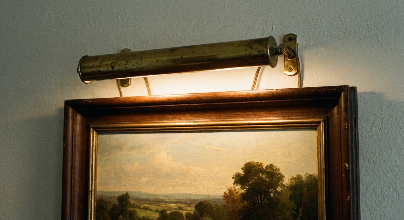
Placement and aiming
Placement is where the glow becomes magic. The aim is an even wash without a bright glare stripe across glass.
Mounting height
- Starting range: Many picture lights look good when the light bar sits about 1.5 to 3 inches above the top of the frame.
- Adjust for real life: Deep frames, chunky molding, or a very tall piece often needs more clearance, or a fixture that projects farther from the wall.
- Quick test: Before you commit, hold the fixture in place (or tape it temporarily) and step back to your normal viewing spot. A small shift up, down, or outward can smooth out hot spots fast.
Aiming angle to reduce glare
A gentle downward angle is usually best. With glazed art, the more you point the beam straight at the glass, the more likely you are to see reflections. If glare is stubborn, adjust one variable at a time:
- Lower the light slightly
- Increase the downward tilt
- Switch to a wider beam source
- Dim it and rely on softer ambient light around the room
Distance from the wall
Some picture lights sit close to the wall, others project outward. If your fixture offers choices, a little stand-off helps spread light more evenly across taller pieces.
Beam spread
Not all LEDs are created equal, even at the same wattage. What you want for art is usually a broader, smoother distribution.
- Narrow beam (often around 15 to 25 degrees): Creates a dramatic spotlight and can emphasize texture, but may produce hot spots on paintings and reflections on glass.
- Wide beam (often around 40 to 60 degrees): More forgiving, better for gallery walls and framed prints.
- Diffused lens or shade: Helps soften the transition and looks calmer in a living space.
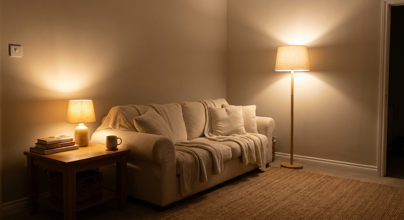
If your room has no overhead fixture and you are relying on lamps plus accent light, you might enjoy Living Room Lighting Without Overhead Fixtures. It pairs nicely with art lighting because both depend on thoughtful layers.
Finish and surface matters
A quick detail that can save you hours of fussing: glare is not only about the art.
- Glossy photos and glass-front frames: Most reflection-prone. Prioritize dimming, a wider beam, and careful aiming.
- Oils and textured canvas: Often look gorgeous with a slightly more directional beam that brings out texture, as long as it stays even.
- Fixture finish: Shiny metals can create little bright reflections near glass. If glare is a frequent battle, a softer or matte finish can be more forgiving.
Installation tips
Hardwired
- Plan the box location so the fixture centers on the art, not the wall stud layout.
- Put it on a dimmer whenever possible. Art looks best when it can glow, not glare.
- Match the dimmer to the LED to avoid flicker. If your LED packaging lists compatible dimmers, that is your best clue.
- Safety first: Turn off power at the breaker and follow local codes. If you are unsure, an electrician is the calmest path.
Plug-in
- Route cords intentionally: Straight down from the fixture, then along baseboard or trim lines.
- Use paintable cord cover for a tidy look, especially on light walls.
- Choose the outlet first: If the nearest outlet forces an awkward cord path, consider moving the art or using a different power type.
Battery
- Check access: Make sure you can reach the switch or remove the light for charging without unmounting the art.
- Use a consistent schedule: Batteries last longer when the light is dimmed and used in shorter windows.
- Keep spares handy: If the light is high up, plan ahead so it does not go dark unexpectedly.
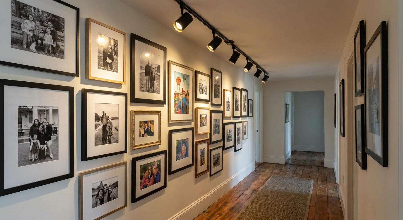
Gallery walls: three approaches
1) Light the anchor piece
Choose the largest or most important frame and add a picture light there. Let ambient lighting carry the rest for a cozy, collected look.
2) Wall wash with adjustable heads
Use track or small ceiling spots to wash the whole wall. This keeps everything evenly visible and feels more like a gallery.
3) Zones of glow
If your gallery wall wraps a corner or a staircase, treat each segment like its own little vignette with its own accent light, rather than trying to cover everything from one point.
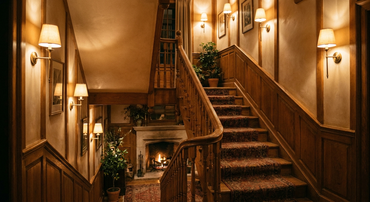
Hallways and stairs deserve special care because shadows can be both unflattering and unsafe. For more on that, see Hallway and Staircase Lighting Ideas for Safety and Style.
Common mistakes and fixes
- Too bright: Add a dimmer, choose a lower-lumen option, or increase ambient room lighting so the art light can be softer.
- Glare on glass: Adjust angle and height, dim slightly, and choose a wider, more diffused beam.
- Fixture looks tiny: Recheck sizing. A light that spans roughly half the frame width (or a bit more) usually looks intentional.
- Uneven lighting on tall art: Choose a fixture that projects farther from the wall, increase the stand-off, or switch to a wall wash approach.
- Color mismatch in the same room: Keep accent lights and lamps in the same general color temperature family (usually 2700K to 3000K).
Quick checklist
- Do you want hardwired, plug-in, or battery power?
- Is the light roughly half to two-thirds the frame width?
- Is the color temperature 2700K or 3000K?
- Is the color quality CRI 90+?
- Do you have dimming (built-in, remote, or wall dimmer) to fine-tune glow?
- Will placement avoid reflections from your normal viewing angles?
FAQ
Are picture lights outdated?
Not when they are sized well and kept warm and subtle. They can look classic in brass and bronze, or modern in slim matte finishes. The key is avoiding harsh brightness and choosing a fixture proportionate to the art.
Should artwork lighting match the room lighting?
Yes, at least loosely. If the room is 2700K and the picture light is 4000K, the art can look strangely disconnected. Keeping everything in the 2700K to 3000K range usually makes the whole space feel cohesive.
Can I use battery picture lights for a whole gallery wall?
You can, but it is often easier to light the wall with track heads or one or two wired accents. Battery lights are wonderful for a few key pieces, especially where cords would be distracting.
What if my art is behind glass?
Use a softer, wider beam, keep the brightness moderate, and angle the light down so reflections do not bounce back toward eye level. If glare persists, shifting the light slightly higher or lower can make a surprising difference.
A final glow tip
If you want your art to feel like part of the room, not a spotlighted island, pair your picture lighting with soft ambient light nearby. A warm lamp across the room, a gentle sconce, or a dimmed overhead glow gives your artwork a cozy context. When the whole space is comfortably lit, your art light can be quieter, and that is where the magic lives.